- Eoin Travers | AI & Data Science/
- Blog Posts/
- Why does logistic regression overfit in high-dimensions?/
Why does logistic regression overfit in high-dimensions?
Table of Contents
The Problem #
Logistic regression models tend to overfit the data, particularly in high-dimensional settings (which is the clever way of saying cases with lots of predictors). For this reason, it’s common to use some kind of regularisation method to prevent the model from fitting too closely to the training data.
The Reasons #
Why is this such an issue for logistic regression? There are three factors involved.
1. Asymptotic Predictions #
In logistic regression we use a linear model to predict (\mu), the log-odds that (y=1) $$ \mu = \beta X $$
We then use the logistic/inverse logit function to convert this into a probability
$$ P(y=1) = \frac{1}{1 + e^{-\mu}} $$
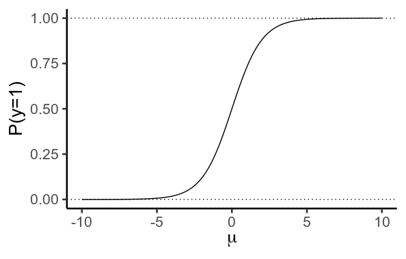
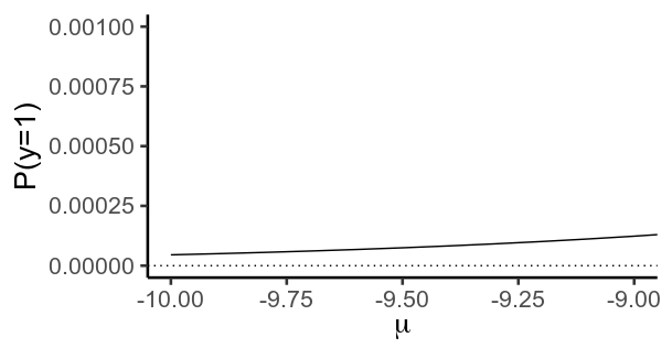
Importantly, this function never actually reaches values of (0) or (1). Instead, (y) gets closer and closer to (0) as (\mu) becomes more negative, and closer to (1) as it becomes more positive. Formally, it has aymptotes at (0) and (1).
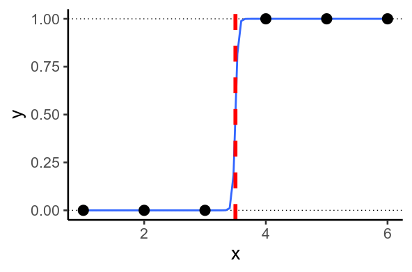
2. Perfect Separation #
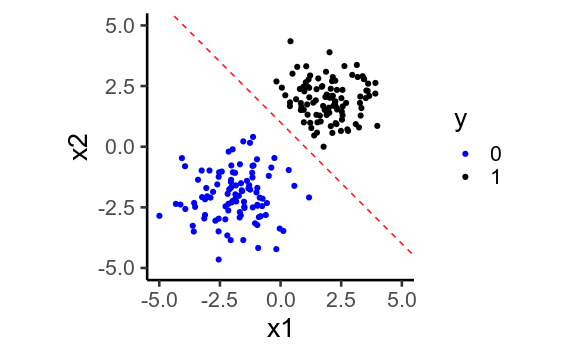
Sometimes, you end up with situations where the model wants to predict (y=1) or (y=0). This happens when it’s possible to draw a straight line through your data so that every (y=1) on one side of the line, and (0) on the other. This is called perfect separation.
Perfect separation in 1D:
Perfect separation in 2D:
When this happens, the model tries to predict as close to (0) and (1) as possible, by predicting values of (\mu) that are as low and high as possible. To do this, it must set the regression weights, (\beta) as large as possible. In theory, the model could fit the data if you could set (\beta = \pm\infty), but your software can’t do that. Instead, it iteratively tries higher and higher values until it reaches values that are too large for your computer to store – the dreaded numeric overflow. The calculations for the standard error of (\beta) will naturally go haywire in the same way. Most software will warn you when this happens, and try to deal with in a sensible way, for example, this is what R does (note the sensible enough estimates, but huge standard errors and non-significant p-values):
df = data.frame(x = -10:10)
df\(y = ifelse(df\)x > 0, 1, 0)
m = glm(y ~ x, data=df, family=binomial('logit'))
# Warning messages:
# 1: glm.fit: algorithm did not converge
# 2: glm.fit: fitted probabilities numerically 0 or 1 occurred
summary(m)
# Call:
# glm(formula = y ~ x, family = binomial("logit"), data = df)
#
# Deviance Residuals:
#        Min          1Q      Median          3Q         Max
# -4.977e-05  -2.100e-08  -2.100e-08   2.100e-08   4.965e-05
#
# Coefficients:
#             Estimate Std. Error z value Pr(>|z|)
# (Intercept)   -20.51   17236.81  -0.001    0.999
# x              41.02   24403.62   0.002    0.999
#
# (Dispersion parameter for binomial family taken to be 1)
#
#     Null deviance: 2.9065e+01  on 20  degrees of freedom
# Residual deviance: 4.9418e-09  on 19  degrees of freedom
# AIC: 4
#
# Number of Fisher Scoring iterations: 25
3. Curse of Dimensionality #
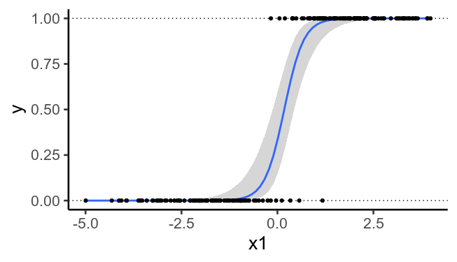
The more predictors you have (the higher the dimensionality), the more likely it is that it will be possible to perfectly separate the two sets of values. As a result, overfitting becomes more of an issue when you have many predictors.
To illustrate, here’s the previously plotted data again, but without the second predictors. We see that it’s no longer possible to draw a straight line that perfectly separates (y=0) from (y=1). Adding the second predictor (the plot above) allows us to fit the training data too well.
The Solution #
In practice, we would like a model that fits our training data well, but that doesn’t strain itself trying to output probabilities of (0) or (1). To do this, we use regularisation: we use a model that tries to fit the training data well, while at the same time trying not to use regression weights that are too large. The most common approaches are L1 regularisation, which tries to keep the total absolute values of the regression weights (|\beta|) low, and L2 or ridge regularisation, which tries to keep the total squared values of the regression weights (\beta^2) low.
Each of these methods has advantages and disadvantages, but they’re beyond the scope of this post. A useful property of L1 regularisation is that it often sets many of the regression weights to exactly (0), meaning you can ignore many of your predictors, which is handy. L2 regularisation is useful in that it’s equivalent to fitting a Bayesian regression model with Gaussian priors on (\beta) (and using the maximum a-posteriori parameter estimate).
In either case, we need to set a regularisation parameter (\lambda), which controls how hard the model tries to avoid using large regression weights. The best value of (\lambda) is typically found using cross-validation for machine learning problems.
Code #
library(tidyverse)
theme_set(theme_classic(base_size = 20))

# Asymptotes
mu = seq(-10, 10, .1)
p = 1 / (1 + exp(-mu))
g = ggplot(data.frame(mu, p), aes(mu, p)) +
  geom_path() +
  geom_hline(yintercept=c(0, 1), linetype='dotted') +
  labs(x=expression(mu), y='P(y=1)')
g

g + coord_cartesian(xlim=c(-10, -9), ylim=c(0, .001))

# Perfect separation
x = c(1, 2, 3, 4, 5, 6)
y = c(0, 0, 0, 1, 1, 1)
df = data.frame(x, y)
ggplot(df, aes(x, y)) +
  geom_hline(yintercept=c(0, 1), linetype='dotted') +
  geom_smooth(method='glm',
              method.args=list(family=binomial), se=F) +
  geom_point(size=5) +
  geom_vline(xintercept=3.5, color='red', size=2, linetype='dashed')

## In 2D
x1 = c(rnorm(100, -2, 1), rnorm(100, 2, 1))
x2 = c(rnorm(100, -2, 1), rnorm(100, 2, 1))
y = ifelse( x1 + x2 > 0, 1, 0)
df = data.frame(x1, x2, y)
ggplot(df, aes(x1, x2, color=factor(y))) +
  geom_point() +
  geom_abline(intercept=1, slope=-1,
              color='red', linetype='dashed') +
  scale_color_manual(values=c('blue', 'black')) +
  coord_equal(xlim=c(-5, 5), ylim=c(-5, 5)) +
  labs(color='y')

## Same data, but ignoring x2
ggplot(df, aes(x1, y)) +
  geom_hline(yintercept=c(0, 1), linetype='dotted') +
  geom_smooth(method='glm',
              method.args=list(family=binomial), se=T) +
  geom_point()