Online Experiments #4: HTML and CSS
Table of Contents
It’s always been useful to be able to run experiments online. Post COVID-19, it’s essential. In this series of posts, I cover what you need to know to move your research online. The posts will be (roughly) as follows:
- How the Web Works
- Choosing the Right Tools for the Job
- The Web Developer’s Toolbox
- Setting the Scene: HTML and CSS
- Hello, JavaScript
- Saving Data [coming later]
- The Fancy Stuff: Animation, Canvas Rendering, Multimedia, and More [coming later]
Setting the Scene #
To build a web page or an online experiment, we need to combine three languages: HTML, to create the contents and structure of our page, CSS, to control the appearance, and JavaScript, to make our page interactive by manipulating the HTML and CSS. In this post, I talk about how we can create and style the elements of our experiments using HTML and CSS. In the next post, we’ll see how to modify them using JavaScript.
Prerequisites #
If you’re not already familiar with HTML and CSS, please read MDN’s Getting started with HTML tutorials (there’s several pages), and then at least the first few pages of their Learn CSS guide. I’ll briefly recap some ideas from those guides, but won’t be going into enough detail if you’re an absolute beginner. In other words, I’ll assume you know the basics of how to use HTML and CSS to build a website, but not how to use them to build an experiment.
Recap #
HTML #
HTML (HyperText Markup Language) is, at it’s heart, a collection of tags that are used to build structured documents such as web pages.
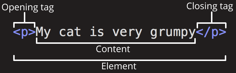
There are many different tags available, but we’re only going to need a few of them for our purposes. Your entire page will be within a <html> tag (that is, between <html> and </html>). The header (metadata) of the page will be inside a <head> tag. In it, we’ll use <link> tags to load our CSS files, and <script> tags to load our JavaScript. The body and contents of the page will be in a <body> tag. Text paragraphs are in <p> tags, while headings are within <h1>, <h2>, etc., depending on the heading level. <img> tags are used to include images, and <a> tags are used for links. <div> tags are a useful way to group other tags, for instance if your instructions consist of multiple headings and paragraphs, you can wrap them all in a <div>.
Anything between the special tags <!-- and --> is a treated as a comment, and is ignored by the browser. Use these to leave yourself notes about what your code is supposed to do.
<!-- This is a big heading -->
<h1>My Title</h1>
<!--
  👆 Try to write more useful comments than this.
  Note that comments can span multiple lines.
-->
Most tags can contain either text, or more HTML tags. Some tags don’t need to contain anything, such as <img>, or <br> (which creates a line break within a paragraph). As a shorthand, instead of writing <br></br>, you can write a single tag the closes itself, <br/>.
Tags can have attributes: additional information that serves a range of purposes. Attributes are defined inside the tag itself 👇
<img id="my-image" class="big-image"
     alt="My image" src="images/file.png"
     something-else="foo" />

<p id="paragraph1" class="instructions">
    ...
</p>
In the code above, the <img> tag has its id attribute set to 'my-image', its class attribute to 'big-image', and so on, and similarly for the <p> tag. All elements can have id and class attributes. No two elements on your page can have the same id, because we’ll use this to identify specific elements later. Multiple elements can have the same class, which lets us identify, style, and manipulate them together. Elements can also have more than one class. Other attributes are specific to different kinds of tag. <img> elements must have a src attribute, which indicates the location of the image you want to show (alt is the alternate text, which is used if the image doesn’t load, or if the user is using a screen reader). Similarly, <a> (link) tags must have a href attribute, indicating where the link leads, e.g. <a href="www.google.com">click for google.com</a>. Finally, you can make up any additional attributes you like, such as something-else="foo" above. These will be ignored by the browser, but can be accessed using JavaScript.
CSS #
While HTML defines the contents of your page, CSS (Cascading Style Sheets) defines how they appear. CSS has a simple syntax.
selector {
    propertyA: valueA;
    propertyB: valueB;
}
The selector is a command that selects certain elements on the page. You can select all tags of a particular type, for example all <p> tags, by using the tag name as the selector. Alternatively, you can select all tags with a particular class attribute (e.g. 'instructions' with the selector .instructions), or select a specific element by its id (e.g. #paragraph1). More complicated selectors are also available, for instance p .text applies to all <p> tags that also have a class of 'text', while p, a applies to all <p> tags and to all <a> tags.
The properties and values are the CSS rules that you want to apply to the elements you’ve selected. You can find a full list of the available properties here, but we’ll typically only need a few of these, such as color, position, and width, which we’ll cover shortly.
Finally, anything between /* and */ in CSS is a comment.
/* Make all <p> tags blue */
p {
    color: blue;
}

/* Center align everything with class 'instructions' */
.instructions {
    text-align: center;
}

/* Change size of element with id 'feedback' */
#feedback {
    font-size: 24pt;
}
Example: Flanker Experiment #
Now, with the basics out of the way, let’s start to put together an experiment. We’ll use a simple version of the flanker task as our example here. We’ll build up the experiment bit-by-bit, as you would when coding it from scratch. We’ll start with a HTML page containing a few key elements, then write the CSS to make those appear the way we need them to, in the right positions. We’ll then add more elements, and more CSS, until we have everything we need.
Bare Bones #
Let’s start simple, with just a fixation cross.
<!DOCTYPE html>
<html lang="en">
    <head>
        <meta charset="utf-8">
        <!-- Everything above this line will be in every page we do -->
    </head>
    <body>
        <p id="fix">+</p>
    </body>
</html>
I’ve embedded the result below, but if you click the button below to open it in a new tab you can properly inspect it using the Inspector Tool.
Basic CSS #
Next, let’s add a <link> tab, which links to a CSS file, style/flanker2.css.
<!DOCTYPE html>
<html lang="en">
    <head>
        <meta charset="utf-8">
        <link href="style/flanker2.css" rel="stylesheet"/>
    </head>
    <body>
        <p id="fix">+</p>
    </body>
</html>
We’ll also have to create style/flanker2.css:
#fix {
    position: absolute;
    left: 50vw;
    top: 50vh;
    transform: translate(-50%, -50%);
    margin: 0;
    font-size: 20pt;
}
We’ve done quite a lot here, so it’s worth explaining the CSS line by line.
First, we’ve set the position property to absolute,
rather than the default value of relative.
This means that rather than placing the #fix element
below the elements that came before it (if there were any),
we’re going to specify where exactly on the window we want it to be,
regardless of where everything else is.
We set left to 50vw, and top to 50vh,
meaning that the left edge is 50% of the way over from the left edge of the window,
and the top edge is 50% of the way down from the top of the window
(vw and vh stand for view width and view height; in other words, the top left corner is in the middle of the window).
We set transform: translate(-50%, -50%), meaning
that we’re translating (shifting) the element 50% of its width to the left on X-axis,
and 50% of its height up on the Y-axis
(or, in other words, that the middle of the element is where the top left corner
would have been, in the centre of the window).
This is quite complicated CSS to get started with, but this pattern
– absolute position, transform: translate(-50%, -50%),
setting the left and top properties –
is one we’ll be using a lot to precisely control the position of stimuli in our experiment.
Finally, we set the margin to 0 (no padding around the text),
and set the font-size nice and big.
Before we go on, click the button above to open the page so far in a new tab, open up the inspector in your browser, and see what happens when you change or remove any of these CSS properties.
More elements #
Now let’s add the most important elements of this task: the target and flankers.
<!DOCTYPE html>
<html lang="en">
    <head>
        <meta charset="utf-8">
        <link href="style/flanker3.css" rel="stylesheet"/>
    </head>
    <body>
        <p id="fix">+</p>
        <div id="stimuli">
            <img class="flanker" alt="" src="stimuli/left.svg"/>
            <img class="flanker" alt="" src="stimuli/left.svg"/>
            <img class="target"  alt="" src="stimuli/right.svg"/>
            <img class="flanker" alt="" src="stimuli/left.svg"/>
            <img class="flanker" alt="" src="stimuli/left.svg"/>
        </div>
    </body>
</html>
To do this, we’ve added image tags,
showing either the file stored in stimuli/left.svg or stimuli/right.svg.
We’ve wrapped them all in a <div> with ID #stimuli, given the middle image the class .target, and the rest .flanker.
Here’s the updated CSS.
#fix, #stimuli {
    position: absolute;
    left: 50vw;
    top: 50vh;
    transform: translate(-50%, -50%);
}

#fix {
    margin: 0;
    font-size: 20pt;

}

.target, .flanker {
    height: 10vh;
}
Since we want both the #fix and #stimuli elements to be located in the same place,
we’ve used a compound selector (#fix, #stimuli) to style both (we could also have done this by giving them the same class, i.e. .centered, and styling that).
You can no longer really see #fix, since it’s under #stimuli,
but that’s not a problem.
The second selector adds properties to #fix that we won’t want to apply to #stimuli.
Finally, we use another compound selector, .target, .flanker,
to apply a rule to anything with either of these classes,
setting their height to be 10% of the height of the window.
Notice that since we haven’t specified the position rule for the images,
they use relative positioning, meaning they’re all side by side
rather than superimposed on top of each other.
More! #
Now let’s add the rest of the elements we’ll need. The screen is going to start looking cluttered, but that’s OK for now. At this point, I’m making some questionable design decisions, because I’m going for a layout that’s educational rather than one that’s ideal for this experiment. Bear with me.
<!DOCTYPE html>
<html lang="en">
    <head>
        <meta charset="utf-8">
        <link href="style/flanker4.css" rel="stylesheet"/>
    </head>
    <body>

        <p id="fix">+</p>
        <div id="stimuli">
            <img class="flanker" alt="" src="stimuli/left.svg"/>
            <img class="flanker" alt="" src="stimuli/left.svg"/>
            <img class="target"  alt="" src="stimuli/right.svg"/>
            <img class="flanker" alt="" src="stimuli/left.svg"/>
            <img class="flanker" alt="" src="stimuli/left.svg"/>
        </div>

        <div id="instructions">
            <h1>Flanker Task</h1>
            <p>Instructions go here</p>
            <button id="start-btn">Start</button>
        </div>

        <p id="scoreboard">
            Correct:   <span id="n-correct">0</span>
            <br/>
            Incorrect: <span id="n-incorrect">0</span>
        </p>
        <p id="feedback" class="green">Correct!</p>

    </body>
</html>
We’ve added three components: an #instructions <div> tag,
and #scoreboard and #feedback <p> tags. We’re using the <button> tag for the first time in the instructions here, but it should be obvious what kind of element this produces. We’ve included <span> tags inside the scoreboard for each of the numbers.
These let us give IDs to spans of text within a paragraph,
and will be useful later when we want to update the text using JavaScript.
Our CSS file has more duplication than is necessary. You can find a more concise version of this code in the GitHub repository associated with these tutorials, which will be released with the next post.
#fix, #stimuli, #instructions {
    position: absolute;
    left: 50vw;
    top: 50vh;
    transform: translate(-50%, -50%);
}

#fix {
    margin: 0;
    font-size: 32pt;
}

.target, .flanker {
    height: 10vh;
}

#instructions{
    text-align: center;
    color: blue;
    font-family: times new roman;
    font-size: 16pt;
}

#scoreboard{
    text-align: center;
    position: absolute;
    left: 50vw;
    top: 0vh;
    transform: translate(-50%, 0%);
    font-size: 16pt;
}

#feedback{
    position: absolute;
    left: 50vw;
    top: 75vh;
    transform: translate(-50%, -50%);
    font-size: 32pt;
}

.green {
    color: green;
}
.red {
    color: red;
}
In the first definition, we’ve added #instructions
to our set of elements that should be centred.
We’ve also added another definition setting some unique properties for #instructions
(I’ve gone for blue text to make it visible over the stimuli, not because I think it looks good).
Similarly, we’ve added definitions for the #scoreboard and #feedback elements,
putting them where we want them.
Note the transform: translate(-50%, 0%) property for #scoreboard:
we’ve shifted it left by 50%, but not shifted up,
so that the top of the element,
rather than the middle of the element, is aligned with the top of the window. Finally, we’ve added the class green to our feedback element,
and added CSS rules so that everything with class .green is green
(and everything with class .red is red).
This will also be useful later when we want to change the colour of the feedback.
Summing Up #
At this point, we’ve created all the elements we need for the flanker task. In doing so, we’ve introduced most of the HTML elements we’ll need for future experiments, and several of the key CSS properties, in particular those needed to position elements absolutely. There are other useful elements and properties, but we’ll cover these later as we encounter them in further example experiments.
The next step, in the next post, will be to use JavaScript (and jQuery) to make these elements dynamic. For this simple experiment, this mostly means showing and hiding each element as needed, changing the src attribute of the images to be either stimuli/left.svg or stimuli/right.svg as needed on each trial, and changing the feedback text and colour. We’ll then look at how to handle inputs from participants (key presses on each trial, and clicks on the start button), before seeing how to put it all together into a fully operational experiment.
The next post will not be an introduction to JavaScript, because like HTML and CSS, there are already plenty of excellent JavaScript tutorials out there. If you’re not already familiar with the language, I suggest reading through MDN’s JavaScript First Steps tutorials, in particular the first two: What is JavaScript and A first splash into JavaScript.